BCA Mobile App Redesign – UI/UX Case Study
18 March 2020
By limenotlemon
Understanding The App
As technology keeps developing, it has now become easier to transfer money to other people. There is no need to go out of the house and find an ATM, all you need to do is open your phone, click your choice of a mobile banking app, and send the money away. One of the mobile banking apps that people use the most is BCA Mobile App, a product of PT Bank Central Asia Tbk (BCA).
The Challenge of BCA Mobile App Redesign Case Study
One of the largest banks in Indonesia helps to facilitate customers to be able to do transactions with mobile apps. In my opinion, an update is needed for their app’s interface design and user experience. There are several parts in it which, I think, can be so much better if modified from the current state it has right now, such as login page, homepage, and transfer feature. As a designer I felt challenged to redesign the BCA Mobile app, and of course the changes I will make won’t replace the initial design it has now. Basically it’s just a different point of view from me as a designer.
So my goals are:
- To create a better user interface and experience.
- Facilitate the use of the application / mobile app.
Some of my assumptions are:
- Remove the other menu that is distracting from what is most used in the BCA app such as KlikBCA, InfoBCA and all the other menu
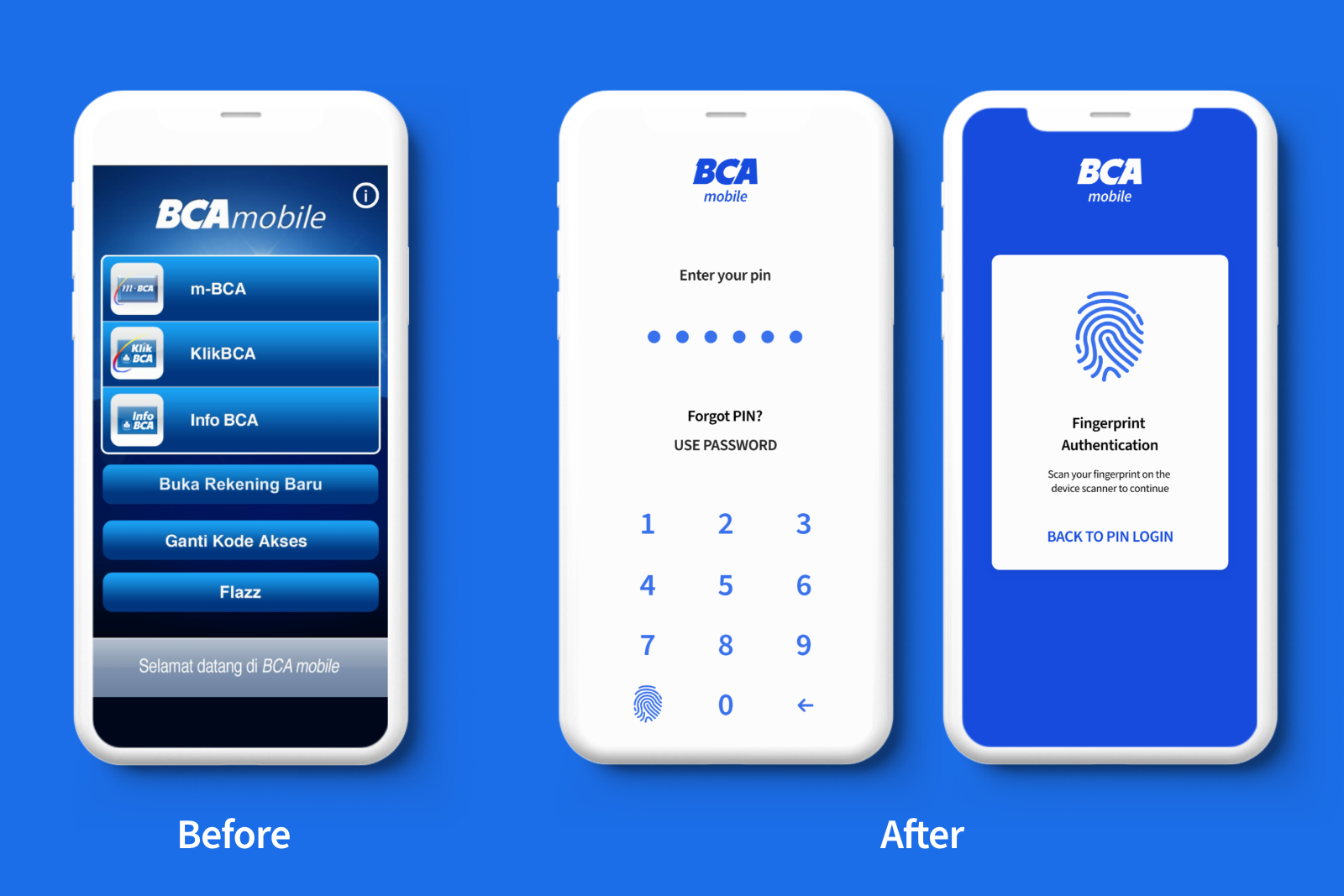 BCA login page
First problem: Which one is the login button?
When a user opens the app, they may get overwhelmed by all the various options that appear before them. A first time user surely will get extremely confused when they see all those wild buttons. Even myself also still get lost when getting to their homepage.
I quickly did analysis to save new users from immense headaches when they want to simply login into their BCA account. There are two login methods : with pin password and fingerprint authentication. In this part, the steps must be clear and short, so users can login right away and go into the homepage instantly.
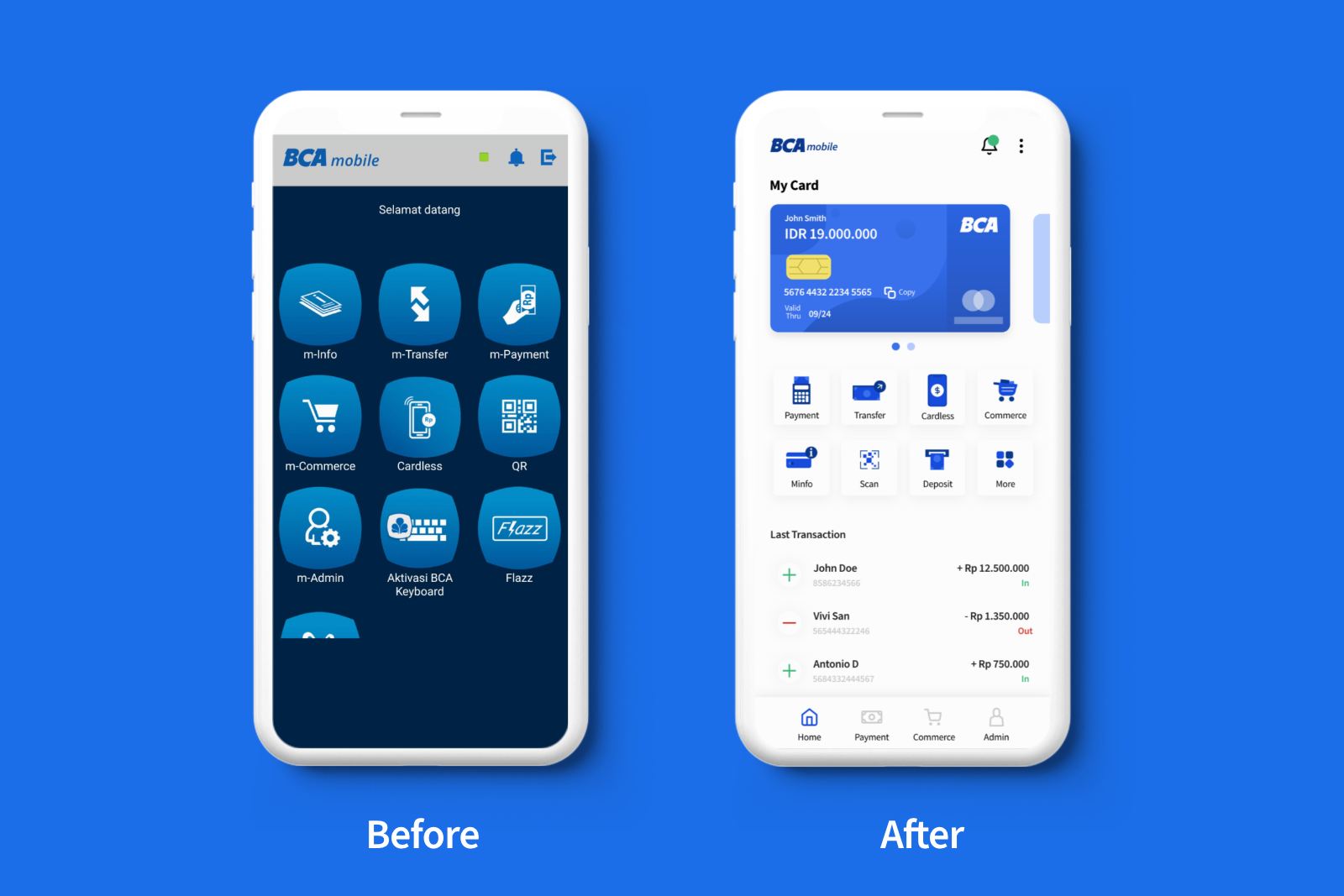 BCA Homepage
Second problem: Outdated interface of BCA Mobile App
On this page, the design shows more detailed information than what they have right now. I have an idea to show the user’s card detail, icon redesign for all the features that exist within the BCA mobile app, and also to add the last transaction history on the same page.
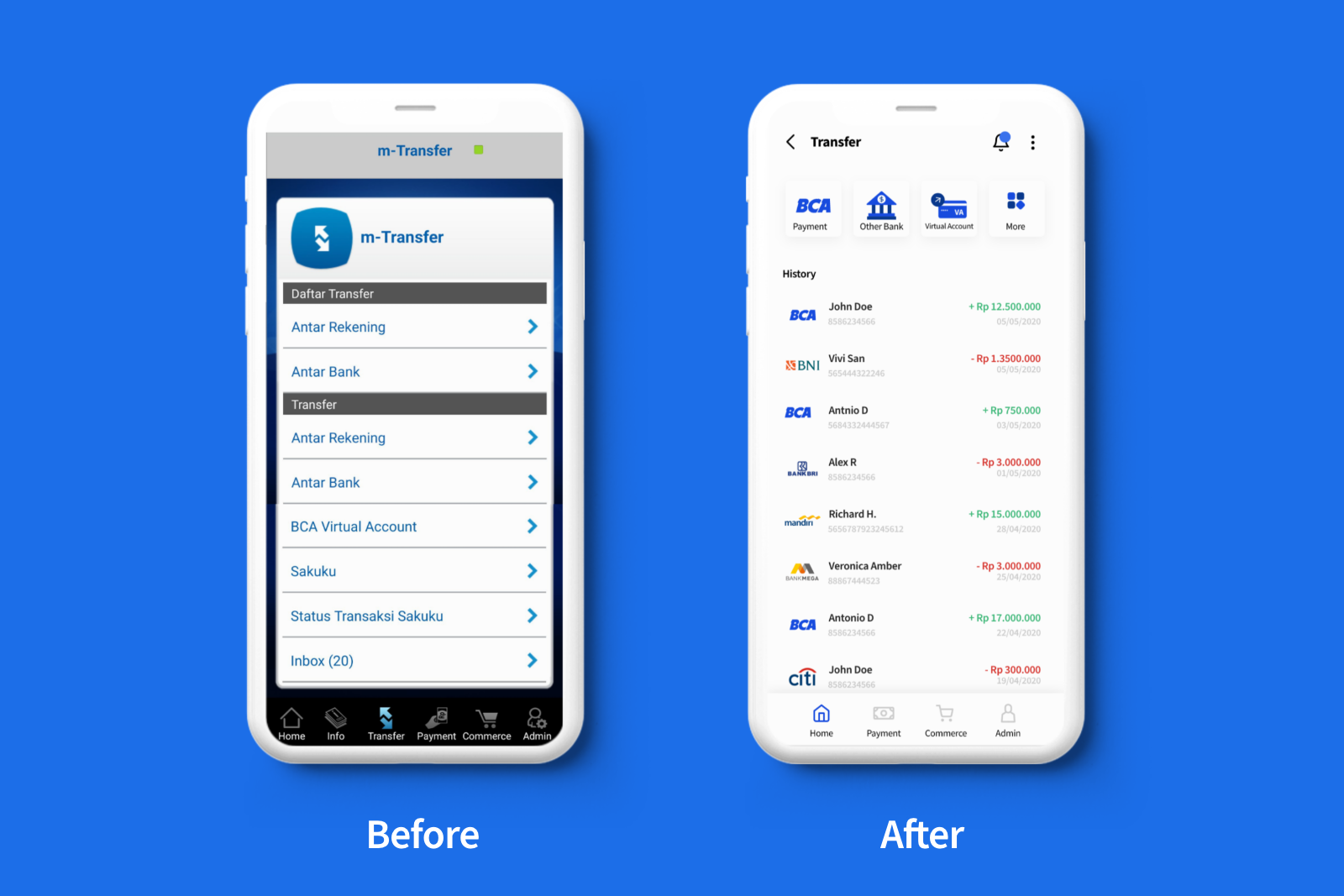 BCA Transfer Page
Third problem: Simplify the transfer feature page
BCA mobile app actually has several options in their transfer page, so I simplify this page’s layout and add more transaction’s history records, so users can easily get information about their transaction’s history, whether it is an incoming or outgoing transaction.
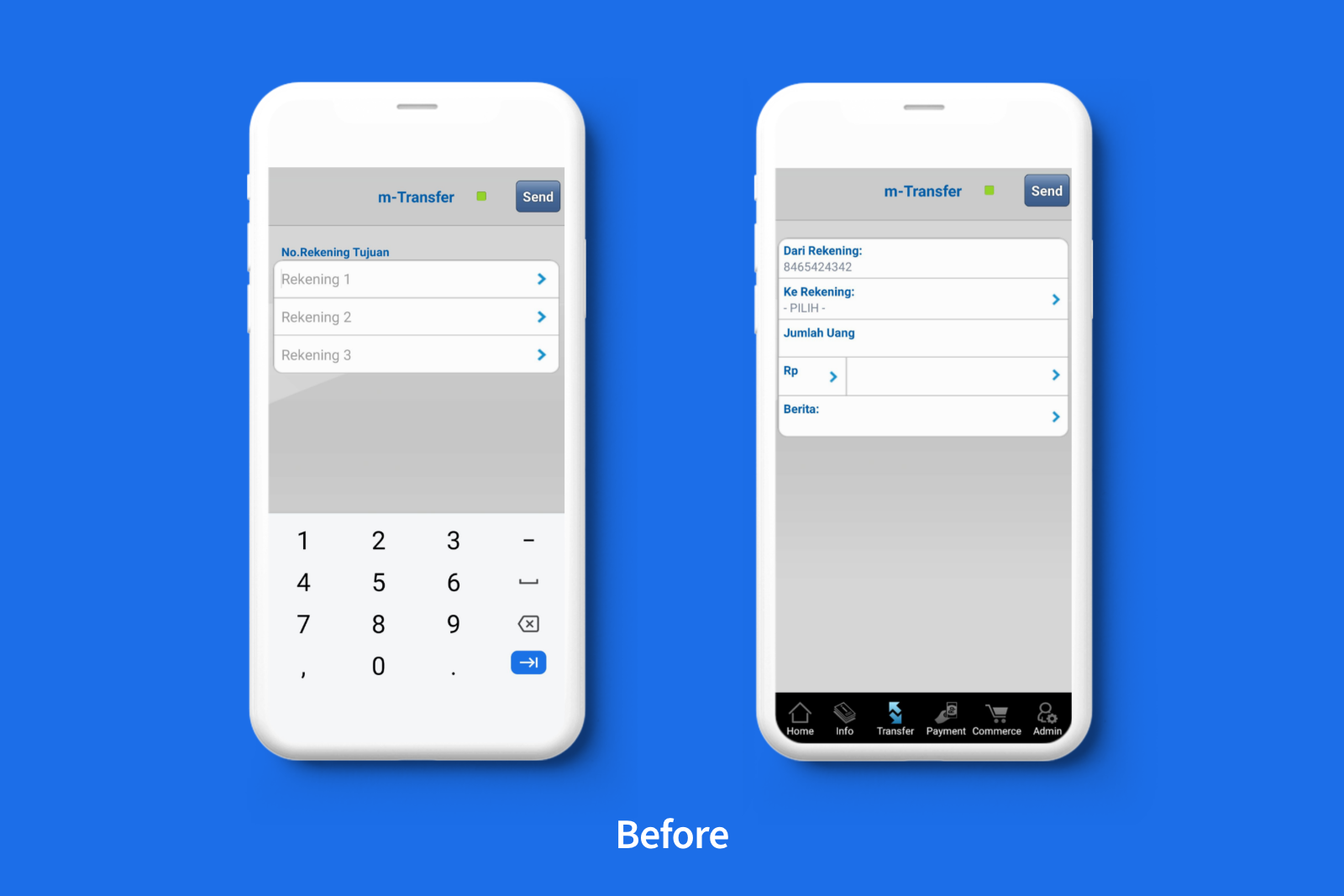 Old design of BCA mobile’s transfer feature
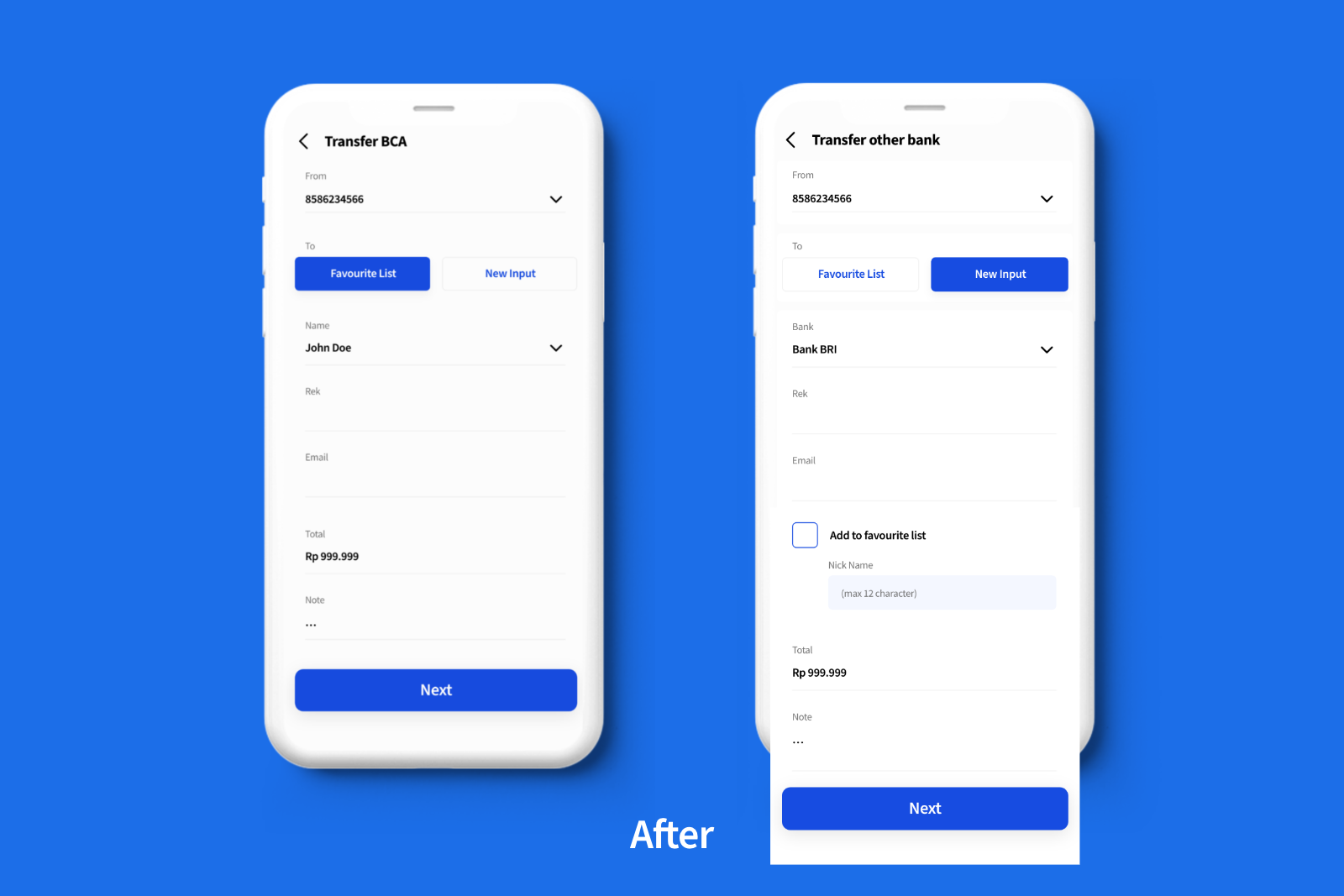 New design of BCA mobile app’s transfer feature
Fourth problem: Transfer to a new account
In my opinion, the main problem that exists within the BCA mobile app is their transfer feature, whether it is to transfer between the same bank, or transfer to another bank. When a user registers a new account detail to transfer to, this is where confusion happened.
I decided to replace the “list of new transfer accounts” with new input, where the user can choose to save that account into their favorite list. So when they want to transfer again to the same account, the data is already stored into their favorite list, and they can just choose it from the list.
Conclusion
So, after I did research and take a look at several points that need to be fixed from BCA mobile apps, such as their login page, homepage, and transfer page, I decided to simplify the interface so when users want to use this app, especially new one, it will take less time than usual and there is no need to try out all the buttons to be able to immediately uses the feature they want.
