
Mobile SEO in 2020 (Update)

17 February 2017
By limenotlemon
Mobile SEO (Search Engine Optimization)
At the end of 2016, something that can not be avoided has happened. Mobile has taken over the desktop as the main tool that people use to surf the internet. This news actually is not that surprising, especially because Google itself has reported in 2015, most internet searches come from mobile devices.
The mobile era is entering its golden age right now. Themes and designs for responsive sites already exist for some time now and are used on many websites. However, it is still more comfortable to access them via desktop rather than mobile.
Why? That is because most of those sites were built for the desktop version first, and then got its copy for mobile version later on. This is not good enough, especially if you want to win in the mobile e-commerce competition.
If your site’s mobile version just an exact carbon copy of its desktop version, then you may want to make some changes here and there. Some aspects that you need to pay extra attention are:
1.Speed is still one of the main factors to determine your mobile SEO success
Image optimization, caching, compression, external javascript limitation, there are many methods that you can use in order to optimize your site’s speed.
If you do not have any idea which elements you should improve, you can use Google’s page speed testing tool (or another similar tool) to find out how you can maximize your mobile site’s speed.
2. Pop-up pages and interstitials should be limited
This is one of the new SEO rules from Google.
“In order to improve the user experiences for the mobile user, after 10 January 2017, pages of websites with content that is difficult to access or read through mobile search will be hard to get high rankings in search results”.
Here are some common mistakes that can make it harder for the users to access the content of your site:
- Using pop-up pages that can cover the entire page when it appears. It does not matter whether the pop-up page appears after the user arrives at a certain page from Google search results or after they scrolling and browsing the content of your site.
- Displaying standalone interstitials that must be closed by the user before they can access the main page.
- Using a layout where the top of the page has a similar look with a standalone interstitial, but the actual content is covered under the layout.
Interstitials? What are those?
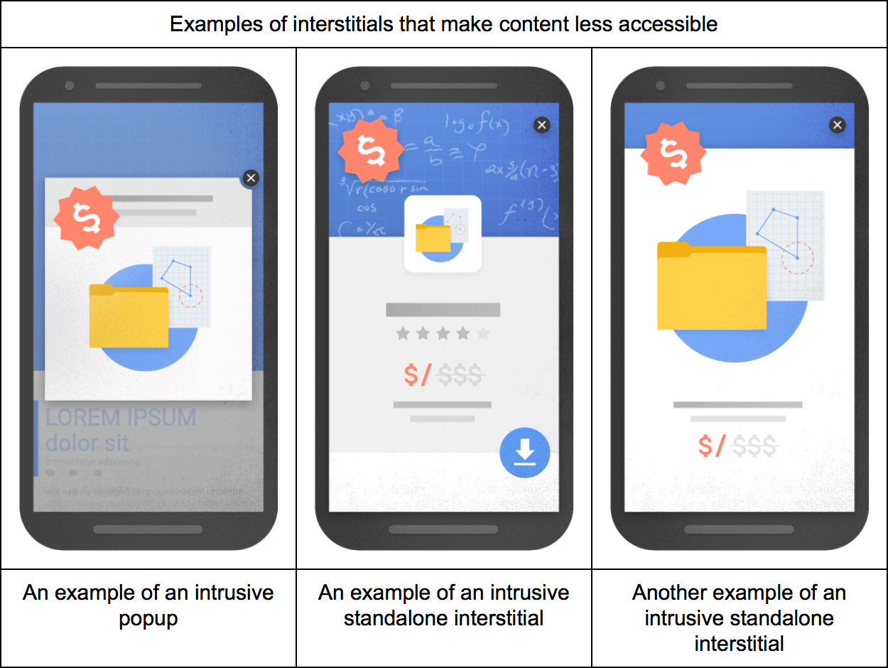
In a website, interstitials are a web pages/pop-up pages that displayed before or after an expected content page. Usually used to display advertisement or to confirm the user’s age (before they are able to see an age-restricted content). Some of them tend to appears suddenly and cover some or even the entire page. That is surely beyond annoying, right?
If you already thought they are annoying in the desktop version, it can be even worse in the mobile version of the site. The main problem is, some of those interstitials pages weren’t made to be responsive. That is why you may unable to close an interstitial page on mobile, even when you already tapped the close or “x” symbol several times.
3. A site with “user-friendly” mobile version can get higher rank in the search result
Google and other search engines always urge the importance of user-friendly sites. If the people who visited the mobile version of your site feel happy, the Google will feel happy too.
4. Crawlability becomes quite important
Crawlability is the ability of search engine like Google to “crawls” inside the texts in your site. The search engine system should be able to easily browse every page in your site without encounters any obstacles or dead end.
So. how you can increase the conversion rate for your mobile site? There are some methods that you can try:
- Put a clear and easily visible call-to-action button
One of the most important factor to raise mobile site’s conversion rate is “easy to use”. Do people who come to your site can easily find what they are looking for?
- Make it as simple as possible
When people browse a site through their smartphone, they usually do not have much time or simply too lazy to read the entire content of the site.
Most mobile users usually have a specific reason to visit the mobile version of your site. For example, they are looking for an easy way to contact you, searching for a particular product or service, or simply looking around before they decide to buy something. So, make sure your mobile site is always straight to the point.
- Make a hard-to-reject offer

There is always a case where people browse your mobile site without the desire to buy something. So, give them something that they can not miss. Give them coupons, promos, etc.
- Turn them into repeating customers
Most people agree that the mobile version of the site is easier to use than its desktop version. Take advantage of that and collect data from your customers, like the phone number or email address for future marketing purposes.
- Using a simpler and faster checkout system
People usually do not like to fill in their data into a long, boring form. It will be easier for your mobile site to convert a visitor into a customer with a simpler checkout system.

You also can add small details like your offline store location (if you have any), a visual calendar that shows the estimation of order arrival, and so on. You need to create a fun shopping experience to reduce the shopping cart abandonment risk.
- Let buyers to freely use any kind of devices they want
Some people simply do not want to choose between desktop and mobile. Sometimes they prefer to shop via desktop, sometimes they like to use their smartphone instead. Give them the freedom to choose any device they want to use. It is your job to create a system that can integrate well with desktop and mobile version, so the customers can resume their online transaction, even when they decide to switch device in the middle of the transaction.
- Use the most relevant content
The amount of content probably will still affect your site’s desktop performance, but in the mobile version, less content is better. In addition to reducing the amount of the content, the layout of the site also needs to be designed in a way where all the important information can be seen clearly.
- Limit your images
The faster site is better. Using too many images not only will slow down your site, but also will ruin your customer’s shopping experiences. The images that seen in the mobile version should be able to get resized automatically based on the screen size and should be adaptive to the touch screen function.
- Optimize filter for navigation
Filter feature is very important for site’s navigation system, especially if you have a big product catalog with several categories.
With a good filter feature, it will be easier for customers to find what they are looking in your store.