Responsive Web Design: The Key to Satisfaction

04 January 2018
By limenotlemon
The Contagious Strategy
Responsive web design is a strategy to make your customers satisfied when they visited your website. For the last decade, we already have plenty of technologies that help us make a better living. We meet mobile phones, tablets, and laptops in hardware. We also meet tons of start-up companies that spread like a virus that develops websites and mobile applications to run their business.
All that technologies give you an easy way to do almost anything. Shopping, traveling, pay bills, investing, and many other facilities. Maybe if you are a start-up guy, you also run some business to pay for all your needs. Either it’s online or offline. But if you run some online business and use a website to present your product, perhaps you need this insight to better your website design.
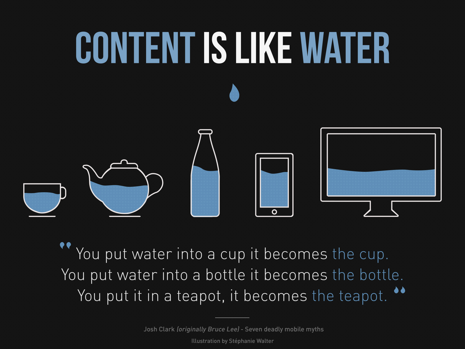
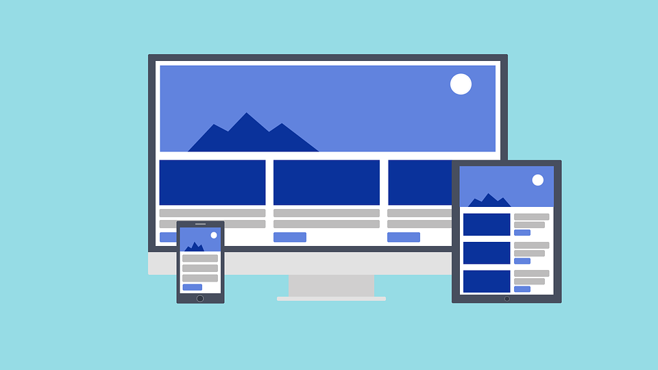
Responsive web design is a design (obviously) to make your website easily read and used by your visitors or customers. Whether they open it on a laptop, mobile phone, or tablet, your website can stretch, expand, and shrink. It’s like water. If you put water into a bottle, the water becomes the bottle. Also, if you put water into your cup, your water becomes the cup.
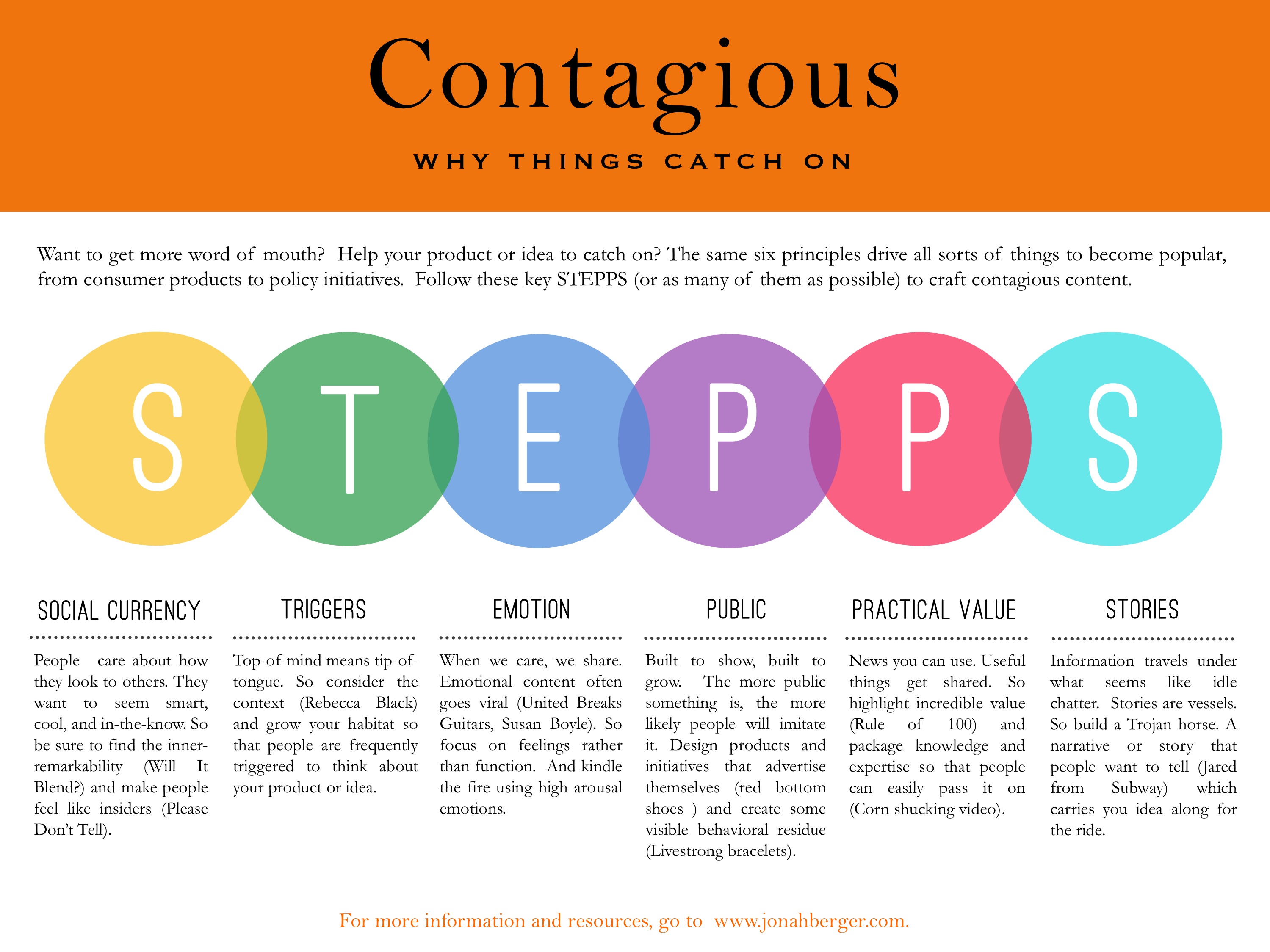
This strategy will make your customer like your website and open it more often. Perhaps they will explain and share how good your website design is to their friends and families. According to Jonah Berger, the author of Contagious, your product will be easily contagious when it has a public-related variable. So it’s not only about the content but also how you design and present the content to your customer. But of course, that kind of design needs at least 4 elements to improve. When you are done with all these elements, your customer will be satisfied.
Elements of Satisfaction
Viewport
In the late 90s, we only have a laptop to open a website. But now, with modern technology in hand, we can browse anything, anywhere, anytime, only by touch or speak. When you open a website in your laptop’s browser, the website will only stretch horizontally (except your laptop has touchscreen and tablet-like features). But it will be different since the website comes to your iPhone or Android devices. It stretches not only horizontally but also vertically and beautifully. You don’t need to zoom in on your screen, and you can explore that website easily.
But what if you open it on your mobile phone? The responsive web design makes your website adaptable to any devices that your customers used. If they use different screen sizes like 5-inch Android, 5,5 inch, or even smaller devices, they still see your website fits on their phone and easily read.
Text Size
Responsive text size also supports responsive web design. By adding the viewport width code, the text will follow the viewport size when the browser is opened by a large desktop, laptop, tablet, or mobile phone. So this is an important part of making a responsive web design.
Media Queries
Sometimes you don’t need words to explain something. That’s why you need media queries. Explain your product with video, picture, or even some music that will make your visitor interested in the product you sell. Sometimes we also use tables, graphs, charts, and other media queries to make your customer understand anything you said.
The most used media on the website is images. Responsive images size also make your website more intriguing. Because not all people need to read 5 paragraphs of explanation about your product when they view the images; instead, they just have to rotate the phone if they need to see it in landscape position. This magic called width property that set the images to 100%, and they will be responsive. Scale-up and down.
Framework

This is the hardest part. If you are not a web designer and don’t know what this is, you can skip it. But if you want to learn, it’s not in this article. About the responsive web design, you can use many free CSS Frameworks on the internet. It will give you some options of how responsive your website design is. Bootstrap is one of the most popular Frameworks to make a responsive design.
And that’s all I could share about the elements. Now I want to explain why satisfaction matters and it depends on your website design.
The Key to Satisfaction
If you begin to start running a small business and want to make more visitors or even costumer, you will need plenty of strategies to take their hearts. Or even if you are not an entrepreneur, you are a blogger, author, or something like that, and you still need this strategy.
Nowadays, Responsive Web Design will be fundamental if you want to increase your visitor statistics. Not only because your design looks good, but also reachable by every people on earth. According to Statista, organic search engine visits in the US coming from mobile devices have hit 51% and are increasing even if you are using a mobile phone, tablet, or laptop. So it’s proven that this strategy is fundamental and extremely valuable.
Maybe if wearable technology like Apple Watch or Samsung Gear has some feature for browsing websites, they will make a responsive web design code for these wearable products. Or maybe before the hologram and virtual reality become epidemical, start removing mobile phone’s screen, and responsive web design will be no more. Because the hologram itself already have some feature like shrinking or expanding. But it will be a long way to go, and this design will fit today’s context.

So if you are willing to develop your business, start by developing your website with responsive web design. But if you don’t skill to do that, but you choose money instead, you can hire us! Not just make responsive web design, but also make a profit. It’s still early 2018, so we can plan your dream and start it right now.
Happy New Year!